Our corporate Identity
We are proud of our corporate identity and have put some thought into it.
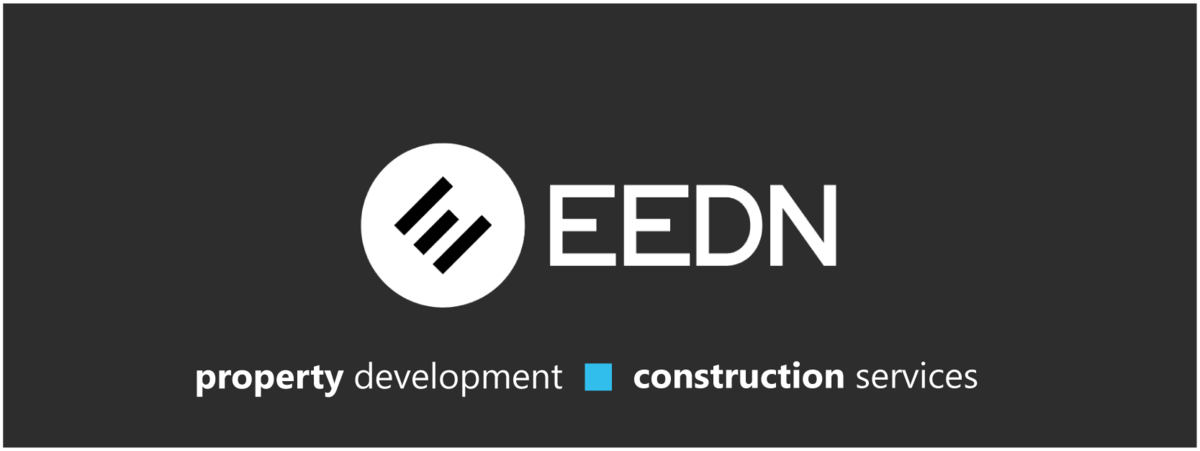
Our logo
Our logo is three lines at 45 degree angle, spelling out the letter 'E', whilst at the same time symbolising the upward trajectory that we seek to bring to all our projects. It also links to the key elements of our business: property development and construction consulting (the two outer lines), with sustainability at its centre.
For other versions of the logo, please see below:
Our colours
We use our corporate colours to signify different aspects of our character. The predominant colours are:
- Slate Grey (45, 45, 45) hex #2d2d2d - this is our standard grey with equal parts of Red, Green and Blue, to demonstrate the equality in our workplace and projects.
- Sky blue (49, 190, 237) hex #32beed - this is our predominant colour, reminding us of the sky that should act as the only limit of creativity and persistence. As a colour, it is the opposite of red, the colour of conflict, signifying we want to be collaborative with our clients and teams. It is also a colour that can be seen by everyone, regardless of their degree of colour-blindness, to demonstrate that we strive to be holistically inclusive in everything that we do.